This code is over 6 months old. The code may have expired and might no longer function.
If you need help, join the Workshop.codes Discord!
What is this?
This is a tool that allows you to create and customize an in-game cursor-based user interface. By using the player's facing angles, the script simulates a cursor that can interact with buttons on the screen.
What's the difference between this and Josbird's Cursor Menu?
I'd define this as a "trimmed down" and modernized version of JCM. Since Josbird is not currently working on it, it doesn't make use of some workshop features introduced after it was released. See some of the basic differences:
| Alo's Cursor Menu | Josbird's Cursor Menu |
|---|---|
| Makes use of local texts, meaning one text/button can be used by all players | Uses player-based texts, meaning that each button has to be created for each player (e.g. if there are 3 buttons and 12 players, 36 buttons may have to exist at the same time) |
| Buttons are created when the match starts, and only their properties are changed. They can be destroyed and re-created any time | Buttons are re-created every time a player opens the menu. This causes server load to take a hit |
| Cursor is bound to the screen edges considering a 16:9 display on 103 field of view | Cursor boundaries are tighter, but can be customized |
| The buttons' clickable areas are calculated automatically, but can be overriden with a secondary string | The buttons' clickable areas are set manually by the user |
| Relatively barebones, comes only with a rule to open/close the menu with the interact button and some extras such as console FOV compatibility. Any other functionality must be implemented by you | Comes with some premade features such as boundary visuals, a button to close the menu, clickable area debug mode and a few more |
How To Use
- Import the code J9FWD into your lobby;
- Mess around with the demo (Optional);
- Open the workshop script editor and copy the rules as indicated;
- Go back to your mode and paste those rules (preferably to the bottom to ensure compatibility);
- Read the rest of this page to know how to configure your buttons!
Creating Buttons
A button is represented by an array of data stored within the cm_Buttons global variable. To add a button, you populate an array with values and assign it to a specific index of the global variable. In simpler terms, the first button's data is stored in cm_Buttons[0], the second in cm_Buttons[1], and so forth.
To see an example, import the code and navigate to the [CM] Add Buttons ★ rule. There, you'll observe two demo buttons configured as Global.cm_Buttons[0] and Global.cm_Buttons[1] respectively.
Each index of the array contains a property for the button. See how they're organised in the table below:
| Index | Name | Description | Data Type |
|---|---|---|---|
| 0 | Page | The page that the button belongs in. Leave it at zero/null to make the button appear in all pages | Integer or null |
| 1 | ID | The button ID. Must be unique | Integer greater than zero |
| 2 | Label | The button's label. Used to draw the button's hitbox unless Hitbox String has a value | String or Null |
| 3 | Clickable | Whether the button is clickable or is just a label | True or false |
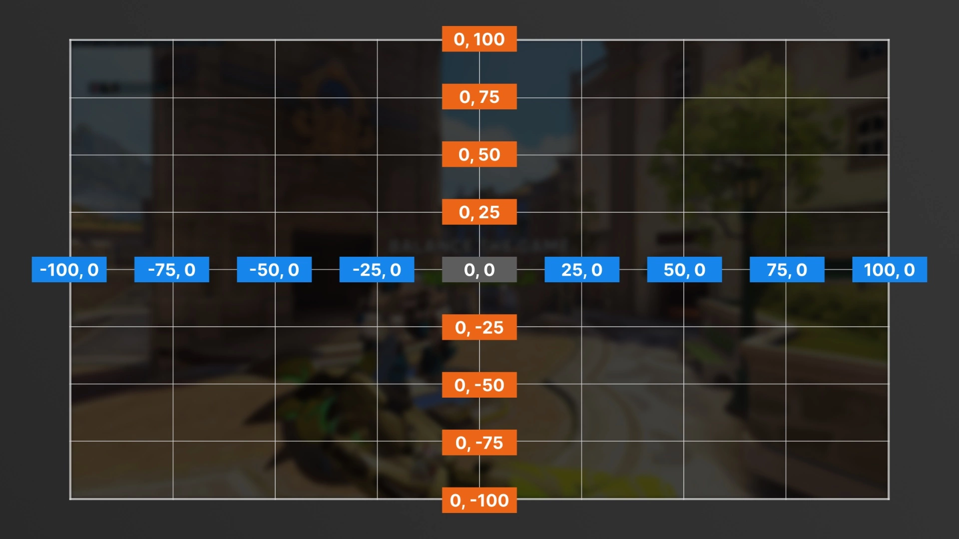
| 4 | X | The X coordinate of the button on the player's screen | Number from -100 to 100 |
| 5 | Y | The Y coordinate of the button on the player's screen | Number from -100 to 100 |
| 6 | Default Scale | The button's default scale | Number from 1 to 4 |
| 7 | Hovered Scale | The button's scale when hovered over with the cursor. If this is different from the default scale, two in-world-texts will be created for the button | Number from 1 to 4 |
| 8 | Default Color | The button's default color | Color or custom color |
| 9 | Hovered Color | The button's color when hovered over with the cursor | Color or custom color |
| 10 | Tooltip | The tooltip that appears on the cursor when the button is hovered over | Any or null |
| 11 | Tooltip Color | The color of the tooltip | Color or custom color |
| 12 | Visible | Whether the button is visible or not. Invisible buttons can't be clicked | True or false |
| 13 | Hitbox String | The string used to draw the button's hitbox. Leave as null to use the label instead | String or Null |
Button Coordinate Map (X, Y)
Updating Buttons Mid-Game
Once a player joins, the contents of the cm_Buttons global variable are copied into the player's cm_ButtonsPlayer variable. This allows you to change each of the button's properties for each player without interference.
To do that, you have re-set the entire button array inside cm_ButtonsPlayer at the corresponding index, as if you were creating the button for the first time. For example: to update a button pertaining to index 3 of cm_ButtonsPlayer, you'd use the action cm_ButtonsPlayer[3] = Array(New Properties). Due to workshop limitations, you can't change individual properties directly.
You can not delete or create buttons mid-game, only change their properties.
Pages
Pages are quite simple. The player's current page is defined by the cm_CurrentPage player variable. Buttons that have their page set to a value will only be visible and clickable when cm_CurrentPage is that value. Buttons with page zero/null are active in all pages.
Triggers
When a button is being hovered on by the cursor, the cm_CurrentHover player variable will be equal to the ID you assigned the button. Use this to program the desired behavior for hovering over the button, if any.
When a button is clicked using Primary Fire (M1, R2, RT) or Jump (Spacebar, X, A), the cm_CurrentClick player variable will be equal to the ID you assigned the button until the button is no longer held. If it is clicked using Secondary Fire (M2, L2, LT), cm_CurrentClick will be equal to the negative ID (so if the button ID is 2, Secondary Fire will set cm_CurrentClick to -2).
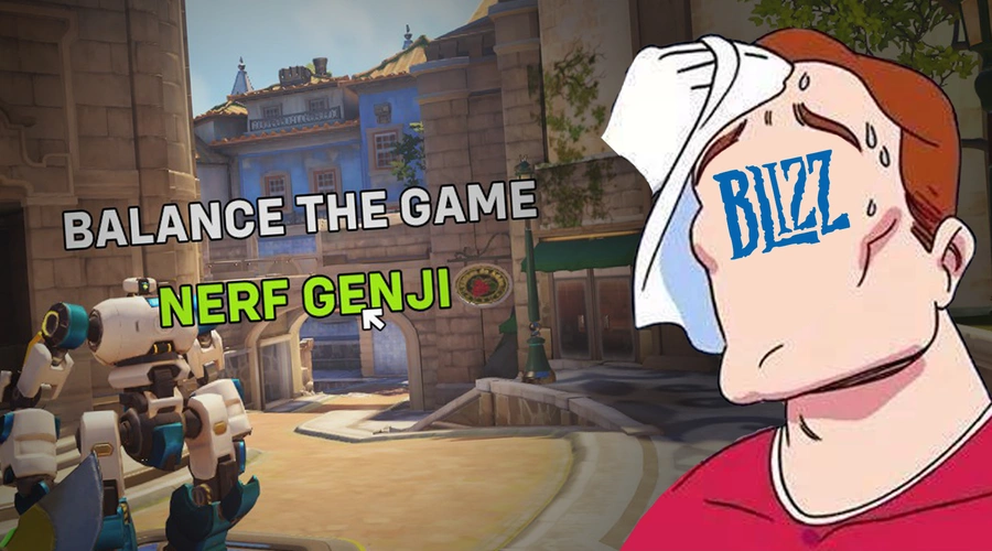
You can make buttons that change pages, for example, by making a rule with the condition cm_CurrentClick == [ID] and the action cm_CurrentPage = [Desired Page].
The import code has two examples!
rule("'Balance the Game' Clicked")
{
    event
    {
        Ongoing - Each Player;
        All;
        All;
    }

    conditions
    {
        Event Player.cm_CurrentClick == 1;
    }

    actions
    {
        Declare Team Victory(Opposite Team Of(Team Of(Event Player)));
    }
}

rule("'Nerf Genji' Clicked")
{
    event
    {
        Ongoing - Each Player;
        All;
        All;
    }

    conditions
    {
        Event Player.cm_CurrentClick == 2;
    }

    actions
    {
        Damage(Event Player, Null, 50);
        Communicate(Event Player, Need Healing);
    }
}
Add-Ons
In Workshop Settings, you'll find 3 toggles, enabled by default:
Tooltip Background: Adds an adaptive dark background to cursor tooltips to improve readability. The horizontal size is determined by the button's Label.
Console FOV Compatibility: This will run a platform check script when the player joins your match, and "tighten" the placement of buttons to match the lower FOV value of Overwatch on console. Be mindful that using a gamepad on PC also counts as a console client.
True Overwatch Cursor: Replaces the cursor texture with the default Overwatch cursor seen in the game's menus. Uses a texture bypass developed by Zezombye.
Sources
This post utilizes other codes either in part or in full. This could be because they remixed them, used parts of them, were inspired by them, or other reasons.